Welcome!

Wednesday, December 5, 2012

My scrapbook process...

I was thrilled when Bethany asked me to join in for December at the Counterfeit Kit Challenge!  I enjoyed working with the team in the past, and was excited to create two posts this month.

For today's post, I was asked to share my creative process with you.  At first, I shook my head and wondered "what on earth I could possibly share about that?".  It's not something I've thought seriously about.  I usually play it by ear when creating a layout, and that seems to work for me.  I had to think about how I go about each step of my creative process.  I came to the conclusion that it really depends on whether I am starting with a photo, story, or other starting point.  I've given some examples of places I might begin.  

Photos:  I truly believe that my real purpose in scrapbooking is to showcase my family photos.  Since converting to digital photography, I no longer print out every single photo I take.  I pick and choose the best photos, and photos I especially hope to scrapbook someday.  There is no way I will ever scrap every photo I print out, but I like having the option.  So, often I start with a photo or series of photos that are important to me, or inspire me in some way.  I tend to gravitate towards photos that capture a person's personality or a special moment in time.  Or, there might be a great story behind the photo that I want to relate on my page.

This layout features a favorite photo of my son, Joey.  He was so adorable at that age, and the photo reflected his love of hats.  The rest of the page was created around the photo.   


 Story:  Journaling is very important in scrapbooking.  I have done pages that don't have much journaling, but I almost always include at least a date.  Sometimes a story is so significant, that I may want to create a page using that story as my starting point.  I have even done a page that did not have a photo, but featured only the journaling.  This is fairly rare, however.  Usually, I start with the photos, and the journaling comes later in my process.  

Here is a page I created using my story as the focal point, and a vintage photo to support the journaling, since I had no photo of the actual event.
 
Product:  I love buying beautiful scrapbook papers and embellishments!!  It's a weakness, which I'm pretty sure I share with many other scrapbookers out there.  Sometimes the product is so amazing, I might start with that.  I then go through my photos, or may even have some in mind that will work perfectly with the product I have chosen.

This layout was created using product from My Mind's Eye Follow your Heart "Be Amazing" paper line.  Although other product items were used, the MME was the basis of the layout.  The photo and embellishment choices were made after the paper was chosen.


Kits:  I have always loved scrapbook kits!  I no longer subscribe to any clubs, but I love the idea of putting kits together.  That's one reason I love the Counterfeit Kit Challenge!  Kits are awesome because they be specific to a theme, or can be very versatile.  When I'm working with a kit, I usually start with the papers and embellishments included in the kit, and find photos that will go well with it.  This is a similar process to how I would use a product line to make a scrapbook page, although there can be multiple paper lines included in a kit.

Here is my very first Counterfeit Kit from February, 2011, and a page I created from that kit.


Sketches:  Sketches are a great starting point for a layout, especially if you are having trouble coming up with ideas.  Looking at the sketch, I usually choose photos that fit the basic orientation of the sketch, and go from there.  This can be fun, because you may end up with something that looks similar to the starting sketch, or resembles it very little.  You can find an endless number of free sites which have sketches of every sort.  You can often narrow your search by size or number of photos, to find the sketch that will work best with your photos and album size.

This layout was made following the sketch shown.  In this instance, I followed the sketch fairly closely.  


Challenges:  This is another great great place to start.  There are hundreds of challenge blogs and websites available on the internet.  Many scrapbook forums regularly post challenges for their members to take part in, as well.  I would highly recommend trying one of these resources, especially if you are struggling with motivation.  Using the guidelines for the challenge, it's easy to come up with product/photos that would work.  You never know where this may lead, often with unexpected results.  I enjoy challenges because they often encourage you to try something outside of your comfort zone.

The inspiration for this layout came from a challenge to use only cardstock as a background for a page.


Putting it all together:  After deciding on photos and product, I typically spread everything out on my table and look at it.  I hold the photos up against various sheets of paper, to see how it looks together.  I don't have any set rules for combining papers and photos, I usually goes with what pleases my eye the most.  I usually compose my background layers first, then place my photos.  I usually will wait to glue everything down I'm sure of the placement.  After photos, I decide on embellishment, title, and journaling placement.  As for the journaling, in most cases I've been thinking about the story the entire time I put the other elements together.  By this stage, I should have a pretty good idea about what I want to say, which is only limited by the space I have to write it. After embellishments, title, and journaling are done, I look at the layout again to see if I want to add/change anything.  I may even leave for awhile, and come back later.  If I'm happy with the result, then I call it done.  I used to be very critical of my layouts, and stress out about every little detail.  Unless the page is for a special project, I can usually be happy with the page however it turns out.  Not every page is awesome, but I have gotten the important things down, which really are the photos and journaling.

Take some time to think about your process.  Is it similar to what others have shared, or is it very unique?  I'd love to hear about it!  Thanks for visiting my blog!

Tuesday, December 4, 2012

February "Love" Mini Kit

I want to thank Bethany and Meridy for asking my to join you all this month at the Counterfeit Kit Challenge!!  I was so excited when I heard what they were doing by having all of the Master Forgers, and a few guests create a page kit and share about their creative process.  I thought this was an awesome way to get caught up on some of those photos we all have laying around, that we may not have had a chance to scrap yet.  I was excited, as well, for the chance to create a page kit for February, the month of "Love"! 

When I think if February, the first thing that comes to mind is Valentine's Day, which is known for "love" themed projects.  Hearts and flowers as well as the colors pink, white, and red are common elements associated with the holiday.

For my page kit, I wanted to go for papers with a vintage shabby chic elegance that I find especially appealing.  I like the how grown up these are compared to the more cutesy quality of many Valentine papers.   Of course, if you have small children, you may want to go more in that direction.

I chose papers from three different manufacturers, but which all have the same distressed look.


Papers include:

Kaisercraft - Sweet Nothings Collection "With Love"
Crate Paper - Paper Heart Collection "Define", "Delicate", and "Valentine"
Glitz Designs - Pretty in Pink "Roses" and "Toile"
Prima - Madeline "Beautima" (half sheet)
Kraft Cardstock - Bazzill

I included embellishments which matched the color and feel of the papers.


Embellishments include:

Clear Stamps - Inkadinkado
Thickers alphabets "Rockabye" & "Marquise"
Webster's Florettes Princess Petals
Glitz Designs Pretty in Pink Giant Rhinestones
MME Miss Caroline Pins & Buttons
Jillibean Soup Sugar Picks
Jillibean Soup Corrugated Butterflies
Webster's Pages Whimsey Heart (pink)
Rose transparency (Glitz)
Tulle Ribbon

My sketch is from Page Maps - February, 2012.  I like how the background is split right down the middle, and how there are multiple layers behind the photo.  This sketch could easily be adapted to any style of page.


Here is the page I created using my kit and sketch.  I love how the papers worked so well with this photograph of my daughter and her boyfriend.  As you can see by my example, a "love" themed kit does not have to be used exclusively for Valentine's Day projects! 


Good luck getting 2012 scrapped!  I hope you are able to participate this month at the Counterfeit Kit Challenge, with all the business and activities of the season.  I'm sure the Master Forgers have some fantastic ideas and inspiration to share with you!

Saturday, October 20, 2012

October Counterfeit Kit

I went back and forth on the October Counterfeit Kit this month.  Although I liked the inspiration kit by http://www.gossamerblue.com, I was really in the mood for something with a Halloween theme.  It seems like very few kit clubs are offering Halloween kits anymore.  I ended up buying the October Afternoon Witch Hazel line from Two Peas because all of their Halloween items were on sale for 25% off.  That satisfied my need/want for holiday themed papers, and so I was able to finish putting together this kit without obsessing about it too much.

Inspiration kit (Gossamer Blue September, 2012):


I had a few sheets of paper from the inspiration kit, and did use those.  I also included more pages from October Afternoon Woodland park collection, because lately I just can't seem to get enough of October Afternoon, despite all the controversy over their never meeting their release deadlines.  I still think they are one of the best on the market.  In fact, I included an old, old page from another OA line from 2007 in this kit, and I bet you can't even tell which one!!  I threw in a few other assorted sheets of paper and some cute embellies to finish it off.  I quite like how it turned out!

My counterfeit:


A little layout

It's been so long since I posted anything, so today I will do multiple posts in an effort to catch up with the blogging world!

Here is one little layout I made from all those pre-made pages I did with the perfect collection class, using my August Counterfeit Kit.  The photos are from our vacation this summer, where my hubby participated in half of a 50 mile mountain bike ride.  It turned out to be such an ordeal for him.  He finished his leg, and we were all really proud of him!


Sunday, September 2, 2012

The Perfect Collection

So, I've been on quite a Shimelle Laine kick, watching every free video of hers I could find, signing up for a few of her classes.  Most recently, I watched "The Perfect Collection", where she teaches you how to cut up an entire collection of paper to make multiple layouts.  I love collection kits, and the concept was a little scary at first.  Being able to actually use up the paper, is very liberating, though!

I used my August Counterfeit Kit as my first attempt.  This was probably more difficult than using a coordinated paper line for a few reasons.  First, the patterned paper base color varies from manufacturer to manufacturer.  Some of the papers were cream based, and some leaned more towards white.  This can pose a problem when putting the sheets together in one layout, because they can tend to look "off".  That made putting the layouts a little more challenging.

Secondly, I had over 100 photos to choose from.  I had trouble deciding if I was just going to scrap them randomly, or if I would just stick to one theme, like vacation 2012.  I decided to go with random photos, but then I had to go through a ton of photos trying to find one that fit my pre-made starting point.

I don't do two page layouts very often, so I was not able to us all the starting point examples that Shimelle gave in her video.  On her website, if you do a search for "starting points" you will find many many examples of different ones to use while putting yours together.  I liked having this flexibility, but not having to think too hard coming up with my own starting points.  

It was definitely a learning experience, which I hope to repeat soon.  I want to scrap all these layouts first before I move on.

Here are the eleven "starting points" I came up with.  I will post the layouts as I complete them.


Friday, August 31, 2012

Ugly paper....and a little layout!

 Back in June, I found a fun swap on challenge blog called "Inspired to Scrap", but unfortunately saw it too late to participate.  The ladies in the swap each sent another person two sheets of the ugliest paper in their stash, which they were then to do a layout with.  My scrappy buddy, Joyce, happened to receive two very ugly sheets of paper, that I also had in my stash!  Can you believe I actually bought the left piece of Sassafras Lass when I found it in a local store!  I had just found out SS was going out of business, and thought I should grad some sheets while I still could.  It's kinda cute, in a weird way.  The other sheet, is just plain ugly.  I had received it in a kit with the rest of the line from SS Amplify.

So, that's how the idea for this layout began.  I was going through a bad patch with my oldest son, Leo, and found this awful photo of him which is a self portrait from his iPod.  I tried to express my mixed emotions in this layout, which is much harder than you think!  It's much easier for me to scrap about things that make me happy!  When I showed it to Leo, he said he hated it, and never wanted to see it again!  I'm pretty sure he is not a follower of my blog, so I'm pretty sure I'm safe.  Can you keep my secret?

Friday, August 24, 2012

End of Summer Blues!

I can't believe summer vacation is over, and I've only posted once during that whole time!  My kids went back to school on Wednesday, and we are all trying to get back into a routine.  I've done a few projects over the summer, but have not posted them.

My biggest discovery this summer has definitely been Shimelle Laine's videos!  I never knew what all the uproar was about her.  I thought she was a pretty and quirky girl with an interesting accent, but never understood the hoopla.  Then, I started watching her Adventures of Glitter Girl free videos on Two Peas in a Bucket.  I was hooked after the first few!


I finally decided to bite the bullet and take one of her classes.  I chose Hitchhiker's Guide to Scrapbooking, because it was such a cool title, so it had to be good!  I had also heard really positive things about the class on the message board.


I've managed to do a few layouts using inspiration from the Hitchiker's Class, but not in any particular order.


In chapter two of the Hitchhiker's Guide, Shimelle discusses "Starting Points" which are sort of like sketches, but with more freedom.  In a later chapter she talks about "Scraplifting".  I kind of morphed these two challenge points in coming up with this layout.   Shimelle did an example almost exactly like this, although it was the mirror image.  I even used a photograph of a waterfall like she used in her layout.  I did not have any of the same embellishments she used, so I used some that were similar in feeling, but not exactly alike.  I quite like how it turned out, although I just realized I forgot to add my journaling.  Ooops!
 

Here is Shimelle's page:

 
Chapter three of the guide was all about sketches.  I did the following layout using a sketch from the reference section of the Guide.  So, you can see I did not follow the guide exactly, but I was definitely inspired by the class.  I am thinking of signing up for another one soon.  Now, I just have to decide which one!


Wednesday, August 8, 2012

August Counterfeit Kit "Summer Lovin"

 I was so excited to have put together a kit this month.  It seems like it's been forever since I made my last kit.  At first I was hesitant, because the inspiration kit is digital, and I'm definitely a paper girl.  Then, as I started looking more closely at the kit, I thought of papers I had in my own stash that matched the feel of the papers in the inspiration kit.

I tried to stay pretty close to the color scheme and patterns in the original.  My plan is to make some of the adorable embellishments that were shown in the inspiration kit, using supplies from my own kit.  

Here is the original "Summer Lovin" inspiration kit by scraporchard:


Here is my version.  

Thursday, May 31, 2012

AKA Bean

Here is the final layout I did using my May kit.  Some people created a dozen pages, but that's not the way I roll.  I did have some scraps left, but I'm tired of playing with this stuff now, and want to move on.

I used a slightly crazed looking photo of our dog, Bean.  He's a character, and I did this page about some of the names he's affectionately known by.  I saw an idea somewhere to use strips of paper as a background for a page, and that's what I did here.  I also misted, splattered, and sewed some crazy ziggy lines on my background.  Thanks for looking!


Saturday, May 26, 2012

A card and three layouts

I have finally gotten some time to do some projects with my kit.  I made a card and three layouts, so far.  Here they are in the order I made them.  I worked with sketches on all of them, and tried not to over think the placement of every item.

A card for my Father-in-law, who sent me some lovely flowers on Mother's Day.  Sketch courtesy of Page Maps (April, 2012).

This layout was done with photos of my daughter and her boyfriend before the Prom.  I struggled a bit with this one, agonizing over every detail.  The sketch was from Shimelle's class "4 X 6 Photo Love", which I recently have gone back to watch.  This design was from March, 2011, hence the three photos.

 I used photos from Mother's Day for this layout, and the journaling tells a little about trying to get a nice photo of the kids and I with limited results.  The sketch came from "4 X 6 photo love", again.  This was the sketch from last February. 


I loved this sheet of paper, and wanted to do something unique with it.  The photo was from a trip to my home town, San Pedro, and my youngest child looking out over the cliffs.  I wanted to convey that disorienting feeling of looking down from a great height.  The journaling talks about the local geography.  The sketch is courtesy of Boys Rule Scrapbook Kit by Jenny Evans.


Thursday, May 17, 2012

Inspired by Shimelle Challenge!

I decided to take part in a challenge going on at Two Peas in a Bucket called "Inspired by Shimelle".  She did an awesome video on NSD, in which she made a kit consisting of:
-10 patterned papers
-5 sheets of cardstock (I only included 3 sheets)
-1 spray ink (Mister Huey/Glimmer Mist, etc.)
-1 stamp set
-1 alpha sticker large (Thickers, etc.)
-1 alpha sticker small (mini alphas)
-1 sheet of bling/embellishments
-1 pre-made/cut die cut accent
-1 set of border strips

Here is what I came up with:


I also used the May Counterfeit Kit as an inspiration for my kit.  This was the April 2012 Studio Calico kit called City of Lights.  I loved the soft colors and browns of this kit, and used that as inspiration for my kit.


I hope to get some pages done with it this weekend!

Sunday, May 6, 2012

Up-cycled gift card mini album challenge

Here is another challenge I did for Absolutely Alter It NSD mini crop.

If you're like me, you get a lot of gift cards over the holidays.  Usually, they get used, and then thrown away.  Did you ever wonder what to do with them, instead of throwing them away?  How about making a mini album out of them?

On this little mini, I used papers from  Kaisercraft "Nan's Favorites" collection.  Give it a try, and you might be surprised what you can come up with!


Saturday, May 5, 2012

Kate's Distress Tag With Water Challenge

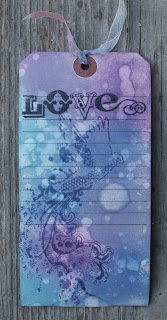
Here is the tag I made for Kate's "Distress tag with water challenge" over at Absolutely Alter It.  I was unsure of how it was going to turn out at first because the color looked like heavy bruising.  After dropping water on the tag, and stamping the images, I think it's lovely.  Thanks, Kate!

NSD Twisted Sketch Challenge #1


Here is my first layout, which took me forever!  This is Challenge #1 from The Scrap Room, and is called Twisted Sketch challenge.  It sure tied me in knots!  Ha, ha!  The challenge was to do a layout using the sketch and punch.  I punched the edge of patterned paper.  I struggled with this a bit, and resorted to blatant product vomit.  I'm not crazy about it, so it's on to the next one!

Happy NSD!! I'm getting my scrap on!


Here is my layout for the May sketch challenge at The Scrap Room.  I loved the sketch, but only only had two larger photos that would fit in a column. 

I also used this as an inspiration for another challenge over at Absolutely Alter It to do a layout about motherhood.

The paper and embellies are from My Mind's Eye Follow Your Heart "Be Amazing" collection.  I love them!

Friday, May 4, 2012

Birthday card

Anton went to a friend's birthday party last weekend, and I decided to make the boy a card, since I have all this paper and stuff at my disposal.  I used the Echo Park "It's a Boy's Life" collection from last month's Paper Lovelies kit, which is perfect for projects like this. 

National Scrapbooking Day mini crop!

Tomorrow, May 5th, is National Scrapbooking Day!  Please join us for a mini crop at Absolutely Alter It message board.  We will have challenges, games, and maybe even some prizes! 

Sunday, March 25, 2012

Feeling Punchy!

Challenge #2 this month at Counterfeit Kit Challenge is to use your punches on a project. I have plenty of punches, but don't use them as often as I'd like. This was the perfect opportunity!

I decided to use my Martha Stewart Butterfly punch on an ATC I made for another challenge. Jess posted a challenge at "Absolutely Alter It" to make an ATC and to purposefully use "Product Vomit" on the ATC. This is not hard to do, since the cards are only 2 1/2 X 3 1/2. I tried to squeeze as much stuff on there as I could while still attempting to make it look attractive.

Saturday, March 24, 2012

I've just return from "The Sanitarium"

No, it's not what you think! Although I may be nuts, I haven't been institutionalized lately! My hubby and I just celebrated out 19th anniversary. After much planning and scheming, we were able to arrange child care for all four kids, with their friend's families. We decided to stay local, and visit a B & B in San Luis Obispo called The Sanitarium. I was intrigued by the photos of the Victorian home painted floor to ceiling in white, and which has some "medicinal" decor! We spent a very rainy weekend, relaxing at the inn, enjoying all the artwork, and going out only to eat and do a bit of shopping. St. Patrick's Day was pouring rain, and the drunks were busy at the bars by lunch time.

The people who run the Sanitarium are working artists, and the place is filled with their paintings. The inn had very strong coffee, the sheets smelled like lavender, and it appealed to our "artistic temperments". I would love to go there again!

Here are a few photos of our stay. I'm trying to imitate Julie Fei-Fan Balzer, who frequently takes photos of paintings that inspire her.

Our room: I liked this typewiter series:I love this mermaid.This Dali portrait was right outside our room. We found it charming!